How is she going to vote? My friend (let’s call her F) just doesn’t know.
This isn’t unusual – about 20% of voters are like her (see Q3).
She needs to work it out fast. She doesn’t like polling stations, so has a postal vote. She has to decide this weekend – or she’ll get busy with work, and not remember to post the ballot in time.
mySociety helpfully list 16 voter advice apps, so I decided this was a chance to test them out!
This is a real voter, who doesn’t like politics – or to be precise finds it “inaccessible”. Exactly the kind of person these apps are trying to help. She’s a 30 year old professional, lives in Liverpool.
It’s a pretty harsh bit of user testing, I’m not going to sweeten my report of her reactions to the sites. So here goes… (Skip to the end for a summary if you get bored)
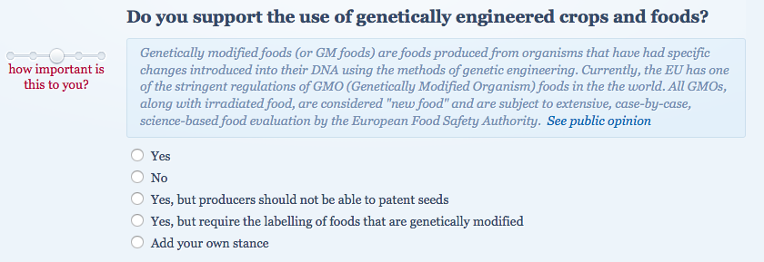
1. Who Should You Vote For? 0/10
We’re on mobile (my Fairphone 1, using Opera browser) – for one thing, we’re on a train and then in a coffee shop. For another, F says she would never do this on her laptop. If she had spare time at home, she’d be more likely to watch Netflix. Voting intention is relegated to spare time while waiting for a bus.
She read the first two questions of Who Should You Vote For? – one about a 50% tax rate for top earners, another about the mansion tax.
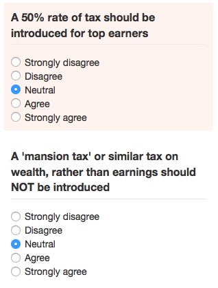 Then declared it boring. She doesn’t care about the questions, and there are too many of them.
2. Vote for policies 1/10
F immediately liked being offered a choice of issues that she cared about. She hated the wording on the more detailed questions that followed – didn’t understand them.
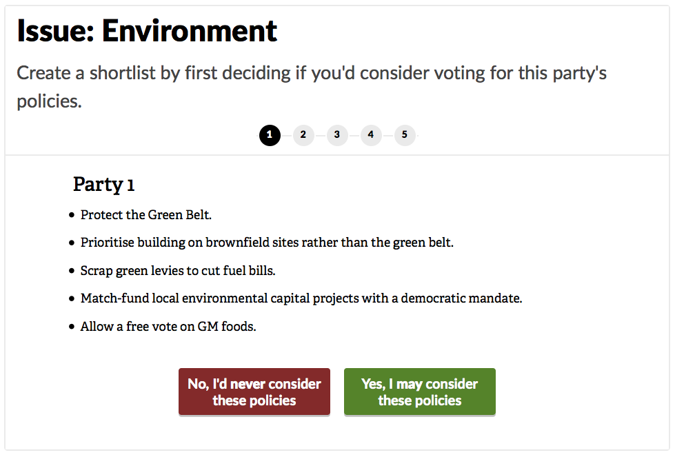
She gave up after the first party. If she could have skipped to the second party she would have, but you can’t click on the numbers to do that.
My view is that the site uses wordings from manifestos, and these just aren’t written in an accessible way.
3. Position dial 0/10
“Pictures? What’s all this stuff? I don’t know what I’m supposed to do.”
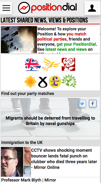
She closed the window. The site is just too confusing a mush, without a clear call to action.
4. iSideWith 9/10
F likes the questions. The interface on mobile was “a bit jerky” – for some reason it kept zooming in when choosing answers. There was also no explicit skip button for questions, but she found out that you can just not answer them.
She liked the “more stances” button, although it rarely satisfied her. In one case she actually typed in a new detailed one!
We lost her answers due to the mobile browser and the train. She didn’t mind – reentered them in the coffee shop. She liked it that much.
She got her answer: Lib Dem 98%, Labour 98%, Green 93%, Conservative 65%. She then tried the function to compare results, she wanted to know why the scores varied. What were the important policies? It wasn’t clear.
All told, the high score was because she found the questions comprehensible, of the right volume, and fun to answer.
5. Vote Match 7/10
It feels like a speed dating site!
“Too hard” – dragging the order of topics. F put the first three in order, but then got stuck. She didn’t know what “political power” meant or what “trending issues” meant. Nevertheless, she went to the next stage no problem.
Her first reaction is that she doesn’t like the questions much, but isn’t sure why. The iSideWith ones were just easier to understand. For example – the “find out more” button for the fracking question explains what fracking was, but gives no context as to why it might be good or bad, or what current policy is.

“The Government’s top priority should be too sort out the deficit” – F didn’t like the wording of the question. It is important, but surely top priority should be to keep us safe and not starving! (My view is that this is over use of standard political wording, which is alienating)
“Public spending should be maintained at least at current levels” – F doesn’t understand what “public spending” means – it doesn’t say what spending! Depends what they cut. Isn’t very clear. (Again this is a political class phrasing and argument, meaningless in day to day life)
“UK is better off in the EU” – doesn’t tell F the postivies/negatives. There is no find out more. Wants a list of advantages / disadvantages of being in the EU.
Result: Green 73%, Labour 70%, Lib Dem 63%, UKIP 38%, Conservative 30%.
F’s assessment so far: This is not helping – one quiz said vote Green the other vote Labour! They didn’t say why in either case.
(Later F tried the Telegraph version of this and quickly realised it was the same. She was skeptical, worried Telegraph would be bias.)
6. YourCandidates.org.uk 1/10
I’ve put in my postcode. It’s telling me what people are. Why? Tells me how to contact them. Hasn’t told me anything about them.
F didn’t see link to “Personal homepage”, she thought it was another contact link.
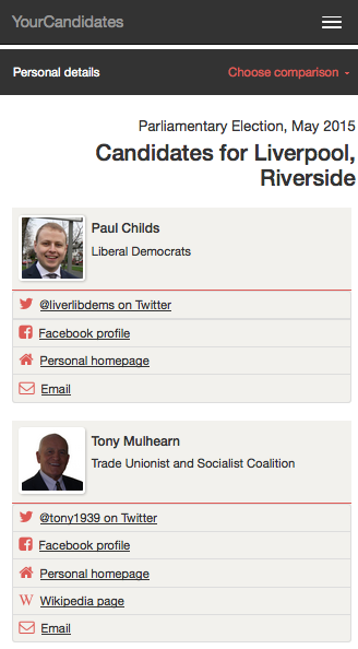
With prompting, she then tried a website of Green candidate. She found there was too much to read, it was irrelevant blog posts, nothing about policies. Wanted policies.
Neither she nor I noticed the “Choose comparison” dropdown, which lets you compare policies, until I was making this blog post later. It’s a bit clearer on desktop.
7. Tickbox 2/10
Weird that they all want my postcode.
The initial “Have I decided who to vote for” annoyed her – of course not, that’s why she’s using the site!
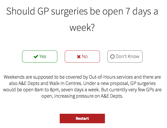
She’d heard people talking about Trident, knew it was about defense, but didn’t know what it was. She liked the explanation on the site – that it was about
cost vs. security. She likes the explicit “don’t know” button. “GP surgeries 7 days a week” – F was surprised! A new question that none of the other sites had asked.
Result: 1) Tory 2) Lib Dem 3) Labour
She didn’t like the answer, doesn’t believe she’s Tory (doesn’t like them, and other quizes didn’t suggest them). Also it only answered 5 questions. So she goes for 5 more questions.
10 questions in: 1) Lib Dem 2) Labour 3) Tory
No Green! Only 3 parties. Not useful. She likes the explanations of the questions on Tickbox, but just doesn’t believe their results. She kept going to see if they stabilised. Grammar schools – likes them, first time asked! (Clever kids get left behind in current schools, not fair)
15 questions in: 1) Labour 2) Tory 3) Lib Dem
Still doesn’t believe it. Also says that the “5 more questions” button isn’t very forceful, and loads of people would miss it. So get incorrect answers from too few questions.
20 questions in: 1) Tory 2) Labour 3) Lib Dem
“It is just making it up”. Likes questions and explanations, but pointless if it is just giving a rubbish result. She asks a general question – how can I know if these quizzes are bias?
8. Who Shall I Vote For 5/10
Too much text on the first page saying it isn’t bias, F didn’t read it and it annoyed her (!).
She likes the choice of issues again. Although now is worried might miss important things. She realises how hard it is to ask about the right issues in these quizzes. She didn’t want to pick 3 topics, it made her pick 3. Now has to do 10 questions on things she doesn’t care about.
UX pain – couldn’t go back and set scale on first question, when on second question. She doesn’t like the lack of any explanation of the questions.
Yay, first to ask about badgers! Likes that.

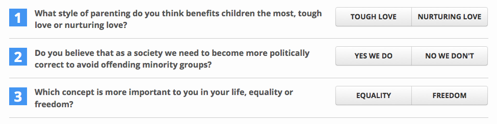
There’s then a principles section which asks really general philosophical questions about approach to life and decisions. She finds them really hard to answer, and has to skip loads of them.
Male or female – why’s it need to know! (She skimmed and didn’t see the “research purposes” bit). She then refuses to tell it who she would vote for – thinks it may bias it, and that it is none of its business. I try to get clarity on this, but couldn’t – it was very instinctive reaction. Doesn’t want to give postcode, hated that, no reason for site to ask.
Result: 1) Green 2) Labour 3) SNP 4) Plaid 5) Lib Dem
Asked very detailed about 3 things she cared about. She likes breakdown of every question by party. Overall though, a bit too detailed. Rather be asked more generic questions about fewer topics.
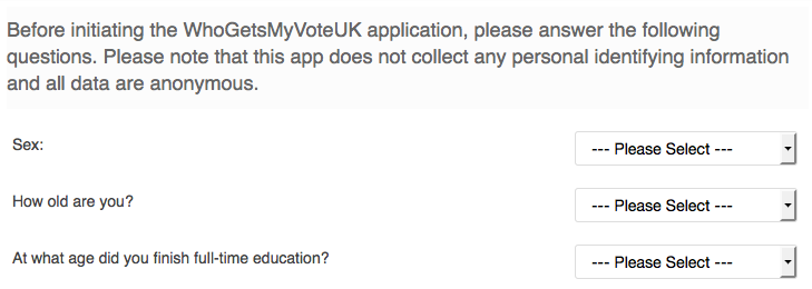
9. WhoGetsMyVoteUK 2/10
Sex/age/education – she hates being asked. The copy says “this app does not collect any personal identifying information”, so she says “why does it need this personal info then”? Skip!
She pressed wrong answer for a question, then the back button goes back to beginning not to the previous question. Rubbish!
Questions seemed OK, but hated losing all her work when trying to go back. Gave up quickly.
She’s getting bored :)
10. Verto 0/10
F doesn’t like being asked where born and where lives. Doesn’t want to answer loads of data collection questions.
This app has left/right swiping like Tinder, which she has never used. She can’t remember which means like and which means dislike! Noticing she’s being slow, the site pops up a helpful dialog.
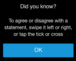
That doesn’t clearly explain which direction is which, so she still doesn’t know! Gives up.
Overall view – she likes idea of playing a game, but it took to long to get there with other questions, and then had a confusing swipe interface.
11. Voting Counts Policy Matrix 0/10
F thought could click on Issues like NHS but can’t. Why such big space when not links? She complains she can’t compare breakdown of parties, that it should be in table!
It’s then that we realise the site doesn’t work right on mobile. I show her the desktop version on my laptop, and she likes the look of it – but that isn’t relevant to this test, which is mobile only.
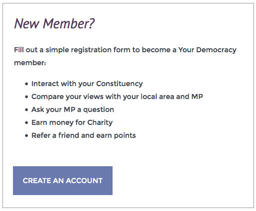
12. Your Democracy 0/10
Got to create an account – not doing that. Can’t be bothered.
13. Awedience -1/10
This site asked for F’s postcode, when she entered it it said “Unknown analysis”.
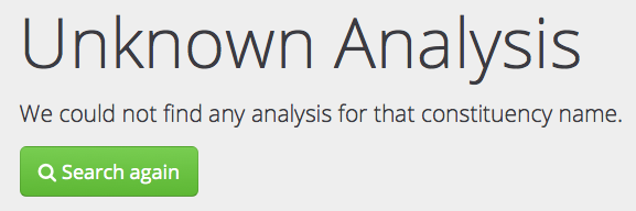
She was so annoyed that she’d gone to the effort of giving her postcode, but got nothing back, she gave it a negative score.
14. Election Compass 0/10
There’s a bug on mobile – can only see half the page, and can’t zoom or drag sideways.
15. The Economist 0/10
F at first worries they’re bias. Suspects they’re not, but isn’t sure why she thinks that.
She complains she can’t read it properly – fonts too small on mobile. Then a box pops up, and she can’t read all the content.
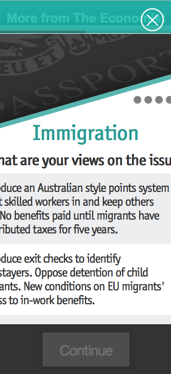
She gives up.
16. YourNextMP.com 0/10
Another site that just tells me about the candidates. Doesn’t help me decide who I’m going to vote for.
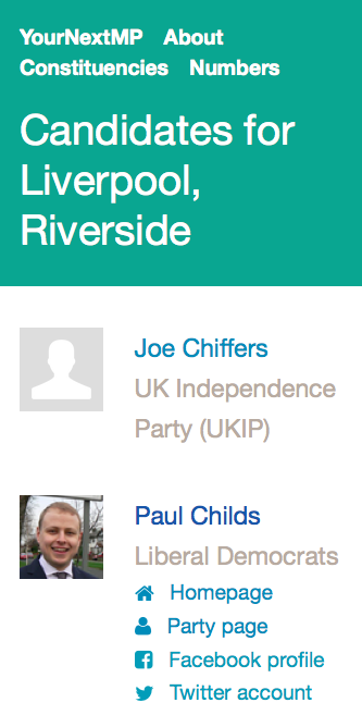
F felt it would be more useful a site to someone who is into politics and already knows stuff. She also felt she’d already seen it – same kind of experience as YourCandidates. Overall, boring.
17. Democracy Club CVs 0/10
I decide to test out this site, which I made! F knows it’s mine, but doesn’t hold off on criticism…
She enters her postcode, then says that because not everyone has submitted their CV, it is not representative. It does makes her think they can’t be bothered, so she sees that as a negative.
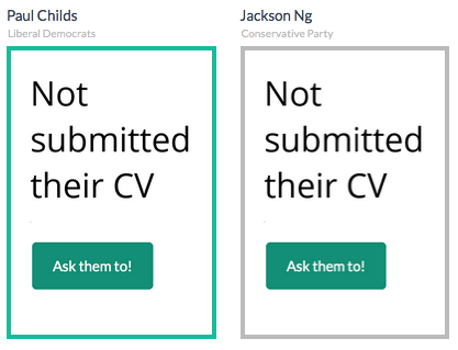
It doesn’t help her decide, tells her about the person. She wants to know about policies.
I don’t want to vote for XXX because she has good experience, if she also kills badgers!
Summary
- Do user testing. Lots and lots and lots of it.
- Write the content properly. Don’t use wordings from manifestos, or any wonkish part of the political system.
- Explain what things mean and current policy. Help the voter relate issues to their own knowledge / opinions.
- Develop and test on mobile. May as well write it in Swahili if you don’t.
- Several quizzes were rejected entirely because of small (in code!) UX bugs which made them unusable.
- Don’t ask personal questions like sex / age / postcode, or even how voted last time. Off putting.
- When giving results, explain simply why – what policies most distinguish the parties in context of what voter cares about.
The winning app is iSideWith! Second and third place go to Vote Match and Who Shall I Vote For.
Nobody else came close, all scoring 2 or less out of 10.
After all that, F still doesn’t know how to vote. She needs help choosing a criteria to distinguish Labour and Green.
Sym mentions this useful post, dissecting fundamental flaws in these advice apps: https://medium.com/@abance/who-should-i-vote-for-there-s-not-an-app-for-that-88cf46532583
Francis Davey points out another lesson – don’t use Likert (strongly agree/disagree). The winning app, iSideWith, has really nice yes/no questions, with option of caveats.
“She needs help choosing a criteria to distinguish Labour and Green.”
Labour manifesto: http://www.labour.org.uk/manifesto
Green manifesto: https://www.greenparty.org.uk/we-stand-for/2015-manifesto.html
If you have time to try out 16 voter advice applications, you can probably find the time to have at least a cursory read of the areas that you think matter to you in those two documents.
Well, I had to force her to keep trying the voter advice apps by the end! She doesn’t like reading long texts, so we never even thought to try reading manifestos.
Radio 4’s Campaign Sidebar covered voter apps, including concerns about their inconsistency: http://www.bbc.co.uk/programmes/b05rk5tl