I decided to investigate Heroku’s early years.
You can learn a lot from even quite recent tech history (see my previous article on version control).
My tool? The Internet Archive. It’s an elephant that never forgets your pivots.

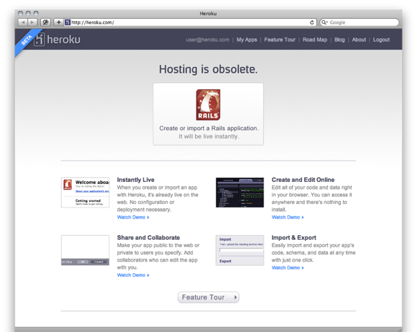
1. November 2007 – code in the cloud
Ruby on Rails is riding high. But impossibly hard to deploy.
Y Combinator startup Heroku’s first home page (see right – apologies for the lack of images, which archive.org has not recorded) screams onto the web.
It’s remarkable just how much it did from the get-go.
Not only did it solve the Rails deployment problem (“Instantly live!”), but you could also write the code in your browser for the first time (well, since Zope!) (“Create and Edit Online”), and share it with others (“Share and Collaborate”).
Really, hand on heart, until you read that last paragraph, did you remember that Heroku had an online code editor? And that was a major part of their initial value proposition? And what’s this about sharing?
Cleverly, they’d realised people will probably be worried about lock in (“Import & Export”). It’s not clear from later home pages that they really were.
No mention of scaling. No origami.
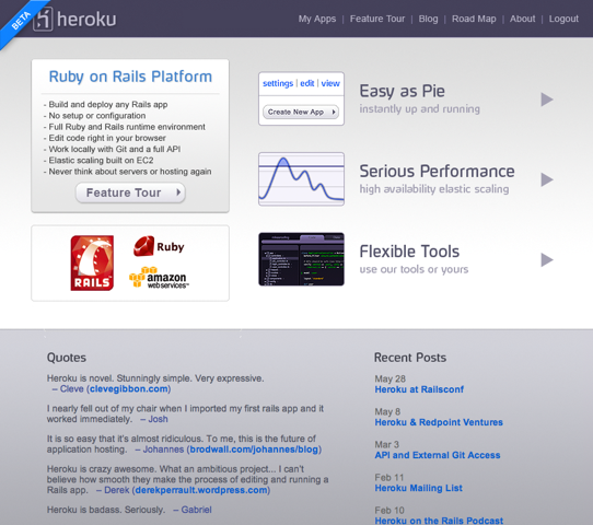
 2. February 2008 – it’s a Rails platform
By February, Heroku had its debut on TechCrunch (including screenshot of their online IDE).
The home page (see later version of the same with images) talks more about deployment and scaling and git, with still a frisson of “coding in the browser”. Nothing about “sharing” any more.
It’s illuminating to read the comments on the TechCrunch post. As ever, full of nay sayers, from the ignorant …
Anyone who thinks Rails is difficult to configure doesn’t know what they are talking about. “Heroku = Fail”
(Rails was at the time very hard to configure on the server, I spent days struggling with hacks to cope with dieing and leaking Mongrel instances, at a time when mod_php just worked.)
… to the preternaturally informed, as you shall see:
Hosting isn’t trivial, but any solution that starts out “OK, give up your editor and terminal and version control and offline editing” seems pretty fishy for anything beyond the 15-minute blog demo.
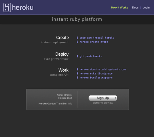
 3. February 2009 – fixed width becomes hip
A whole year passes until Heroku change their home page (see later version of the same with styling) again.
Several radical changes. For the first time ever (well, maybe since the early days of the web), actual code appears on the front page of a fashionable website. And not just Ruby or Python code, shell code.
My explanation for this suddenly being hip again, is the resurgence of the Mac around this time. OSX makes Terminal.app accessible to people who five years earlier would have used Windows and thought the command line was for dumb retrobates (sic).
What a home page! All shiny and black with a fixed width font, and $ signs. Wow.
Secondly the value proposition has simplified to three points. 1. Instant ruby deployment. 2. Git. 3. API. The latter two were merely mentioned in passing a year before, now they’re a key part of the value.
Github launched the previous April and at this point has 45,000 registered users and is on an exponential growth curve. Not too surprising that Heroku give git higher billing this year.
The most radical change is what is missing. Have you spotted it?
Tucked away at the bottom of the page is a tantalising link. “Heroku Garden Transition info“. WTF? A blog post “What’s up at Heroku” explains. They’ve completely rewritten it.
We also learned what our users want from a commercial version of the platform, and surprisingly to us, we discovered that there aren’t just a bunch of features we need to add, but some we need to remove as well (platform features often involve trade-offs).
Having made that discovery, we knew we needed to create a second version of the platform, to pursue exactly those requirements, designed from the ground up (with our hard earned knowledge) for commercial production use.
Features removed?
Indeed. No more online code editor. No more sharing. That’s all hived off to herokugarden.com. “Learn Rails, Work from Anywhere, Move to Heroku Later” is the value proposition of that new (erm, old) app nursery.
 4. October 2009 – doubling down, adding on
In the autumn, it changes again (see later version, much the same with styling). Even more code, more clearly showing you that the commands are everything you need to get started. It’s the geekiest home page ever.
That said, there’s a much better split of the page; the value proposition for people who don’t speak /bin/sh is now laid out clearly on the right.
Again, the most important thing about this new home page is hidden away at the bottom (at least in the later 2010 version, it’s commented out in the HTML of the original 2009 version).
“Add-ons”. Despite throwing away features with their rewrite, an absolute corker of a big new feature appears. It’s how Heroku becomes effectively “an app store for systems administration”. But that’s another story.
This final home page holds them out well, lasting beyond the next December when Salesforce buys Heroku for $212 million. Cash.
Coda
If you love the origami, and are wondering when it appears, that is as late as June 2011.

And Heroku Garden?
In January 2010, just three months after its debut in October 2009, it’s axed. Poor thing.

I like to think that one of the founders of Heroku shed a tear. That they’d spent at least a year arguing until they were fit to explode just how important the online code editor was, how a “YouTube for web app sharing”, a “Google Docs for coding” was the next big thing.
And then watched the relentless figures, as everyone just used the deployment system, ignoring the editor, ignoring the sharing. Silly, it was the “app store for sysadmin” that won it.
For the record, I’ll wager that in 10 years time loads of people will be coding in the cloud. In their web browser, and using apps on their tablets. It seems crazy right now, but you’ll see. It seemed crazy 10 years ago that we’d all be using an online office suite.
Meanwhile, remember the lesson. Even the best don’t get everything right straight away.
Do several things well. Double down on the ones people like.
Great story.
Thank for sharing.
Awesome post, please write more like this!
Great article. Proves that (profitable) online businesses should follow the same rules as offline ones. ‘Smell what sells’, and pursue it.
Link to comments on this on Hacker News (where it was a front page for a day or so):
http://news.ycombinator.com/item?id=3933327
Since this author of this article seems so smitten with the origami I thought I’d share this story. I interviewed with Heroku in May 2011 when the current site design was in its final stages. I had the pleasure of sitting next to our designer, Todd, during that week and watching him create the origami images. It was shockingly low-tech. He folded some paper cranes, then draped his black hoodie jacket over his office chair and put the cranes in different positions in the chair. Then he took pictures of them with his iPhone. He imported those pictures into Photoshop and worked just a little touch up magic to get the final images you see on the site today.
This talk by Adam Wiggins is a great telling of the story of Heroku’s main pivot: http://www.justin.tv/startuplessonslearned/b/286516447
Awesome article. Illuminating example of what being lean, pivoting and adjusting is all about.
James Lindenbaum, one of the founders of Heroku, sent me this email when this blog post was on Hacker News:
“Hey Francis – thanks for the write-up of our homepage history, I enjoyed
reading it through – gave me some nostalgia.
“If you want more complete images of the sites for your post, I’m
attaching what I’ve got. We also launched the famous how-it-works page
around the same time as the early 2009 site, so I’m attaching an image
of that, and long before the origami were the Japanese characters we
introduced in our pricing around late 2009, so I’m attaching that as
well (you can see the pricing link appears on the late 2009 homepage).
“To address your point #3, we didn’t add code to the homepage because we
were following a hip trend, but rather we were intentionally
overcorrecting for the messaging mistakes we had made prior to our
pivot. We had scared off some serious developers because we had a code
editor which seemed to them at the time like a toy, and we wanted to win
them back. So we launched a homepage that was targeted straight at them
(and ourselves, frankly): dark background resembling a terminal or dark
TextMate theme, zen minimalism, straight to the point, example code,
nothing else. It worked better than we expected (though we did catch a
lot of crap for it from some PR and marketing folks).
“- James”
2007
2008
2009, Feb
2009, Oct